The purpose of this page is to show a sample of beta testing a site.
Please specify the type, make and model of the device(s) you used to access the site.iPhone 5S
Safari and Chrome
Dell PC Windows OS
Chrome, IE 11, and Firefox
2. Please specify the type and version of the browser(s) you used to access the site.
Safari
Chrome
IE 11
Firefox
3. Assess the site’s overall layout and design. List all functional, performance, text, and visual problems you experienced.
General (all browsers)
Password login could be changed to GovTech Works Logo – this can easily be done
WordPress is very hard to secure for a government website
The read more button under tactical cloudlets is hard to read. in the PHP or there are many options for plugins that allow this It’s generally not a good practice to only use placeholder text for input labels (the contact form) I’ve attached code for an example that actually moves the place holder text up like a label after the field is selected. This is also generally not 508 compliant. This is confusing because a user will click on this to fill out the form quickly and may tab to the next field, it is inconvenient to have to click away to discover what should be there. This can especially be inconvenient if the field auto-inputs text that is incorrect and the user has no way to confirm if the right information is filled out. Recommendation: http://bradfrost.com/blog/post/float-label- pattern/
Dark gray on light gray is not 508 compliant
Recommend implementing an editorial calendar to schedule content after it’s gone through html/css updates, image optimization, and reviewed with a checklist of tags and keywords to optimize the pages.
It’s confusing to have arrow buttons that do not function as buttons. Why not make the entire area clickable?
The social media buttons on the far left require double clicking; a single click would be more convenient and may hinder mobile users. Would recommend removing all of these boxes except the ... dots and changing the dots to say share. Then a user knows that these will let them share any page and is not going to take them to GovTech
Works social media, it also will show them every shareable option quickly. The RSS feed link in the footer goes to the actual XML feed (https://www.govtechworks.com/feed/) would recommend changing this to direct to subscription options. WordPress has multiple encoding options that allow the reader to direct bots to the xml feed, mobile users to a mobile friendly option, and web users to a subscription page. If you would like an easy fix I would recommend integrating FeedBurner or MailChimp. FeedBurner is a google tool, is free, offers analytics, lots of integration options, and is very easy to setup in less than 5 minutes.
Every article should be coded to integrate title tags, alt tags, taxonomy, Meta data, cross-link to other relevant articles on the site, mention the relevant category and link to it, as well as use structured data and rich snippets.
https://developers.google.com/custom-search/docs/structured_data?hl=en
https://developers.google.com/structured-data/rich- snippets/reviews
https://codex.wordpress.org/Writing_Posts Every page should have a relevant Meta data description.
Every page should have relevant meta data keywords that are researched based on demographics, site analytics, and site goals. Keyword research can be done using google webmaster tools, yahoo, google analytics, google AdWords (free tool), WordTracker, spyfu, wordstream, twitter, youmoz, or similar tools. The best tools tend to be Google’s and they are free to use and easy to do competitor evaluations. Dark gray on black is very hard to read and not 508 compliant All videos should include a transcript option. Please note alignment issues. Example page: https://www.govtechworks.com/talking-tech- continuous-diagnostics-and-mitigation/ If you want these videos to go viral every video should include a link to the video on vimeo and YouTube at the bare minimum. There are many tools that integrate quickly with WordPress that can automate uploading the video and descriptions to other social networks. It would also be useful to make GovTech Works run like a podcast system to automate the RSS feed submission of videos to iTunes and Android.
YouTube is the second most used website and search engine with billions of views daily. If the goal is to have views, the descriptions, SEO, and submission of these videos is essential. Someone should also be dedicated to determining analytics and which thumbnails, keywords, and demographics are the most effective for viewership, comments, and sharing.
Recommend moving related articles down or adjusting placement of the primary image so that some of the article details are above the fold. This way the user does not immediately lose attention, since they came to the page for the primary content and are not likely willing to give more than .3 seconds worth of time before they lose interest. Plus most of the articles use stock images that are unlikely to draw attention.
The jump to sections buttons are invasive and add clutter Skip navigation and tabbing does not appear to be present on the site Not responsive for all sizes:
Will you be including contributors? Does this site auto-pull in articles from other outlets? I.e. Defense news etc.
Suggest a story, advertise, and research all go to contact us – perhaps when a user lands on the contact page the PHP could automate selecting a dropdown option for why the user is contacting GovTech Works? OR this page could be completely eliminated since the contact form is on the same page they clicked on those links to arrive on the contact page. What will research be? If advertising will be on the site that needs to be disclosed consistently. There are lots of transparency laws that require any reviews of products or services to be mentioned in articles, any freebies to be disclosed, and a list of advertisers has to be on the site even if that is done using Amazon prime, Double Click, or Google Ads. What does the tab contact page add for the user? This form could be automatically updated based on one dropdown menu or checkboxes as to why the user is contacting GovTech Works. The tabs clutter the page, are not user friendly, and have no additional information for the user.
Would recommend giving the user the option of a number to contact someone or a brief description of why they want to contact GovTech works. Remember not all users who access the website will be doing so without disabilities. Some may use e-readers, some may be on mobile devices, and others may have color-blindness as a barrier between the site and optimal viewing performance. The site should have a goal and get users to use it in the most efficient way possible. Would recommend adding a dynamic contact form to the footer of every page. When the user submits the contact form based on why they are doing so a link to more information could be offered. If the contact form was added to the footer universally, the contact us link in the navigation could be removed adding more room for the topics to be spread out. Lots of research has been done on the popularity and UX of main navigations. For a blog, it is important to get readers to the most commonly used resources on the site in the main navigation. For this website, that means the topics and sectors. These are currently being hidden inside a dropdown menu, unnecessarily. The subscribe link is redundant. An RSS button is at the top and bottom of every page, the sign up for our newsletter form is on many pages (and could be integrated near the contact form). Remove scrolling header
Navigation is not accessibility friendly Topics main pages take up too much of the above the fold. Rearrange items to feature content better.
No results found – Under the analytics section.
Many images on the site are not web optimized – the weather image under the homeland section is a good example. This slows down the site significantly, is scored very poorly by google and other search engines and is not web standards compliant.
Recommend adding links to relevant articles from the about us excerpt.
Recommend including a longer about us or link directly to GDIT’s about us.
Footer nav is redundant
Create a sitemap
Create user roles
This section could be used to highlight the article and why it is interesting An excerpt, image, and/ or meta data should be included.
Some sections are missing content The home page is excessively long without a goal to add value to the reader.
Contributors and what we are reading sections should be removed.
Recommend changing Nav:
<nav id="top-menu- nav">
<ul> <li><h2><a style="
color: #C31300;
font-size: 21px;
padding: 0px;
margin: 0px;
">Sector:</a></h2></li>
menu-item- object-page menu-item- 3401"><a
href="https://www.govtechworks.com/sectors/defense/">Defense</a></li>
menu-item- object-page menu-item- 3382"><a
href="https://www.govtechworks.com/sectors/federal-civilian/">Federal
Civilian</a></li>
menu-item- object-page menu-item- 3403"><a
href="https://www.govtechworks.com/sectors/state-local/">State &
Local</a></li>
menu-item- object-page menu-item- 3402"><a
href="https://www.govtechworks.com/sectors/public-safety/">Public
Safety</a></li>
menu-item- object-page menu-item- 3404"><a
href="https://www.govtechworks.com/sectors/homeland/">Homeland</a></li>
<li id="menu-item- 3401" class="menu-item menu-item- type-post_type
<li id="menu-item- 3382" class="menu-item menu-item- type-post_type
<li id="menu-item- 3403" class="menu-item menu-item- type-post_type
<li id="menu-item- 3402" class="menu-item menu-item- type-post_type
<li id="menu-item- 3404" class="menu-item menu-item- type-post_type
<li id="menu-item- 3621" class="menu-item menu-item- type-post_type
menu-item- object-page menu-item- 3621"><a
href="https://www.govtechworks.com/topics/analytics/">Analytics</a></li>
menu-item- object-page menu-item- 3622"><a
href="https://www.govtechworks.com/topics/cloud-data- center/">Cloud &
Data Center</a></li>
menu-item- object-page menu-item- 3624"><a
href="https://www.govtechworks.com/topics/cyber/">Cyber</a></li>
menu-item- object-page menu-item- 3623"><a
href="https://www.govtechworks.com/topics/trends/">Trends</a></li>
</ul>
<li id="menu-item- 3622" class="menu-item menu-item- type-post_type
<li id="menu-item- 3624" class="menu-item menu-item- type-post_type
<li id="menu-item- 3623" class="menu-item menu-item- type-post_type
What we’re reading – seems a little too personal and more blog like than corporate. The tone of voice should be consistent.
When a user makes the site smaller for responsive viewing, the hamburger menu navigation items are unreadable if you hover (become black on black)
Related articles related articles should always include meta data like the author, date, and a thumbnail of the related video. These results can be maximized by coding results to be shown based on user preferences, demographics, keywords, or even recent searches and page views. It is a good practice to make sure all articles have an image; articles that do not have thumbnails can have the GovTech Works logo by default until they get a thumbnail or simply not be published until the article is completed. Choose a standard excerpt length as well so that all images line up perfectly. If the author for articles is always going to be GOVTECHWORKS remove the author meta or make it invisible. It is extra clutter on the page and completely unnecessary. The same information can be conveyed to bots and search engines using tags.
Examples of other useful tags:
http://www.vervesearch.com/blog/how-to- implement-the- relauthor-tag- a-step-
http://www.thecreativepenn.com/2013/02/28/keywords-metadata-
https://moz.com/blog/meta-data- templates-123
http://www.iacquire.com/blog/18-meta- tags-every- webpage-should- have-in-
http://www.dpci.com/blog/taxonomy-vs- metadata
Research blog taxonomy
Include google webmaster tools suggestions and google analytics for testing
Sort posts by categories, sub-categories, and offer users the ability to subscribe by category.
The top Google+ link goes to LinkedIn and the Facebook button tries to download a file. by-step- guide/ discoverability/ 2013
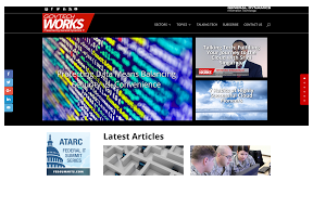
The GovTech Works logo on Twitter is pixelated and distorted. More tweets should be added before go-live, an editorial plan should be in place to automate this at least 3 months in advance. Social media management, keyword tools, and reputation management tracking should be in place. Images in search results and archives are very large. This is great for article pages but takes up a lot of “above the fold” space. This means the users will end up paginating a lot or just not see as many articles as quickly as necessary. It also has the potential to slow down mobile browsers (haven’t got to testing that yet). Smaller images would allow them to skim more articles quickly, and find the right article for them. Moving the title or meta data information over the top of the images would save space and allow more room for excerpts. Images are still very important and allow the users to quickly glimpse what articles may be about. Some images for various posts seem to use very bland stock imagery that has little or nothing to do with articles.
Subscription options I would recommend checking the news recap or weekly article by default (one or both based on what you would like the most people to subscribe to). It’s often nice to include a hover CSS tool tip that tells users what this will look like or include. You could even include a link to an example of what an article looks like. Would recommend allowing users to sign-in to the system, if a user signs in and is already subscribed, you could hide the newsletter sign up option or allow options for the user to edit their subscription and category preferences. This may also allow the user back-end functionality based on your preferences. The user might submit requests for certain types of articles, interact with editors, chat with other members, have forum access (something not on the site now), or even see all their past comments.
Would be useful to include a newsletter archive https://www.govtechworks.com/subscribe/ The included image is bland.
The arrows would be better off as read more buttons or using glyphicons Commonly used icons and images should be in sprites (logos, icons, social media, dropdown icons, read more arrows) All images need optimized Excessive use of H1 tag with little variation Excessive use of jquery and sliders that do not add value. No email verification appears to be setup Newsletter page doesn’t say what asterisks mean (indicates required field should be included at the top of any page or section that has a form field input with asterisks indicating requirements.
The search taxonomy doesn’t seem to be very accurate. I selected the search icon at the top of the page in the main navigation area.
Regardless of the search I enter, it is hard to tell why the results are selected after my search is entered. It may be more appropriate to integrate a third party search. If this is using a basic WordPress theme, the search features probably require additional programming. I would recommend using Google Custom search: https://developers.google.com/custom-search/?hl=en or automating the taxonomy setup process and have a copy/tech writer create a list of common keywords based on popular articles and past known searches found in analytics.
Would highly recommend replacing the basic commenting system with Disqus. It uses Gravatar images, was initially built to integrate WordPress fully, is one of the most commonly used blog commenting systems, and allows user filtering, spam protection, as well as integration with social media. Safari – no browser specific issues found Chrome on iPhone– no browser specific issues found Chrome on PC– no browser specific issues found IE 11
Excessive padding at the top of search results, would be helpful to say “search results of ___” Two x’s show up in the search Tabs look like they are on two lines Toggle content sometimes moves up instead of down, which means the user ends up in the middle of the content instead of at the top reading down. https://www.govtechworks.com/9-keys-to-a-successful-cloud-migration/ (on smaller responsive) Responsive issues with sharing Logo looks stretched
Firefox– no browser specific issues found
4. Assess the content of the site in terms of:
Topic Excellent
Relevance to GDIT
Quality of headlines
Very Good Average Below Average Quality of analysis
Image quality o o o
Video quality o o X – use of videos
Overall
aesthetics
Banners
Color scheme
The site has very clean lines and appears to have a web 2.0 style template, but is lacking accessibility. The stock imagery appears to be high quality photos, but they do not seem to add interest to the page or aesthetic appeal that brings interest to most of the stories. The best images on the site are the ones that appear relevant, like the video thumbnails. I rated the color scheme below average because it is hard to read in some places, is not accessibility friendly, and the bold colors take away from the content. Red should be used sparingly for items you want to call attention to. White on white and gray on gray is very hard to read even for users who are not color blind or visually impaired. Most of the site’s layout and padding has a template feel to it. With some CSS customization and minor changes to articles the site would read better and content would stand out more. A few minor tweaks and I would rate the look and feel excellent.
5. Evaluate the site’s navigation:
Was it intuitive? Redundant, poor color scheme for readability, not up to web standards or common standards of UX for ease of use
Did any links take you to the wrong place? If so, please specify. Yes, listed above.
Could you get where you were going with a minimum number of clicks? No.
6. Evaluate the overall performance of the site: Did the site seem slow? Not on my computer, because it’s fast. Was slow on my phone, images loaded slowly, and failed load testing.
Did pages, images and videos load quickly? No.
Were the calls to action (subscribe, provide feedback, etc.) easy to understand?
Arrows would be better off saying read more, subscribe and contact us would be better off in the footer. Redundant navigation items should be rearranged. Headers should be catchy, short, and include relevant keywords; all articles should have obvious call out buttons.
7. Did you come across any errors or non-functioning components within the site? If so, provide the URL, a description, and if possible, a screenshot.
Yes, they are listed above with screenshots.
8. Were there any issues that you had within the site that you believe were attributable to a known firewall issue?
No, but I didn’t test for that.
9. Assess the level of interactivity the site offered.
Was the ability to subscribe easily accessible on every page?
Yes but the checkbox descriptions could be improved and one should be checked by default
Was the ability to post content to social media easy for the user?
It’s in an easy place to ignore but also invasive to the site. Would be better off at the top/bottom of each article only with active call outs. Was the ability to share content with friends or provide feedback easy for the user?
Recommendations added above, but would recommend narrowing down to top networks and having a share call out at the top and bottom of articles. Lots of UX research has been done on this and it is the most effective way to get users to share content. The scrolling bar is not obvious that it is for sharing. The scrolling bar is invasive. Disqus would auto integrate more sharing options. Calling out share now at the bottom or top of articles may increase sharing. Recommend A/B testing.
10. Please feel free to share any additional comments you may have regarding the site.
Added above
No comments:
Post a Comment